Exhibitions visited recently

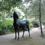
26th July :  Towner Gallery in Eastbourne.

Edward Stott: A Master of Colour and Atmosphere:

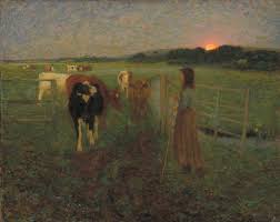
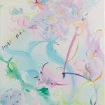
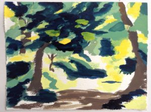
I was interested in Edward

Stott because of his rendering of light and dark.  I particularly like this painting (right) and was also drawn to the subtlety of some of his night time paintings, generating atmospheres of both mystery and homeliness at the same time (Left)


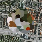
At Altitude :  This was a small but fascinating look at aerial imagery.  The Towner website describes it thus: “Ranging from the exhilarating viewpoints of early aviation to the all-enveloping but flattening vantage point of Google Earth, the exhibition charts these changing perspectives, illustrating how the wonder of the overhead view was transformed through advances in technology as altitudes became higher and horizons more distant.” 

There were images from Google Earth to Peter Lanyon’s “Soaring Flight”:

There is a great deal more information and some explanatory YouTube videos on the Towner Gallery website:  http://www.townereastbourne.org.uk/

8th August:  Royal Academy.

The Montafon Letter

Tacita Dean: Landscape.  

Majesty

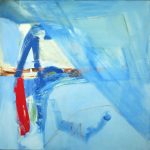
I had been wanting to see more of Tacita Dean’s work since watching her film “JG” two years ago.  To my mind she is an unusual and interesting artist partly because of her versatility and partly because of the deeply intellectual approach she brings to some of her work whereas other work is quite simple in its concept (such as her collection of four-leafed clover.)  I was not disappointed – her large works (“The Montafon Letter” and “Majesty”) are quite ethereal and the whole exhibition seemed to cry “deep thought”.  However the film “Antigone” appeared disjointed, but the soundtrack was so poor that I didn’t understand much of it anyway.
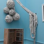
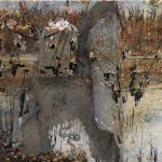
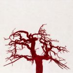
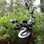
Summer Exhibition:  

This was the usual bunfight of already-famous people frame to frame with hope-to-be-famous people.  I went round rather fast taking pictures of what caught my eye the most.  Here are some of them:

  1.  I find Hughie O’Donoghue’s paintings very moving – quite ethereal in their rendition and extraordinarily atmospheric.  This one is no exception.
  2. Fiona Rae uses soft pastel colours in her latest batch of canvases – very “girlie” in a way if one is expected to associate such colours with girliness.  My question is “do we have to?”
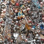
  3.  Rufus is a dog covered in what is described on the label as “costume jewelry” ie tat from charity shops etc.  He looked amazing – so incongruous.
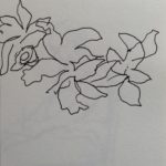
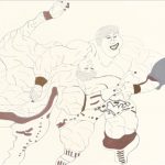
  4. I included this one because I like the simplicity of the drawing and the economical use of colour.
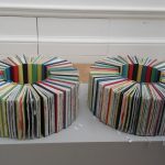
  5. “Stedman Doubles is a triumph of unseen labour.  The books are arranged in circles with their pages hardly visible.  Yet each page is screen printed.  The title refers to a bell ringing sequence.  See https://www.jhmorris.com
  6. I liked the simple concept of this installation made entirely from newsprint and two pegs.
  7. I had to include this one – typical Kiefer!
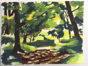
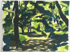
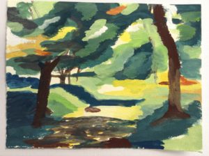
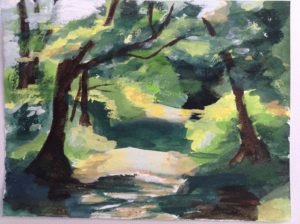
  8. Tony Bevan showed similar work from his “Tree” series in 2016.  My own prediliction for trees is the reason for its inclusion.  See http://www.tonybevan.com/

https://www.royalacademy.org.uk/

Hannah Peschar Sculpture Garden

The Hannah Pescher Sculpture Garden is a treat for the senses – a mix of lush greenery and still waters mixed with sculpture and the occasional, slightly rickety, bridge.  Sadly, along with most gardens, it has suffered from the heat and drought this summer – the water was a bit low and murky and the grass was brown in patches.  Also the day was cloudy so the light wasn’t great.  However  the sculptures were varied and interesting.  Also we met Vikki Leedham who runs the place.  She came to talk to us at Chichester about her work and her commitment and enthusiasm for the place was inspiring.

If you want to see pictures of the gardens at their best, look on the website:

http://www.hannahpescharsculpture.com/

In the meantime here are some of mine:


Today

Over the past few days I have been painting a scene from the “Meadow” near my home.  I have made several small watercolour sketches :

Destined for the bin.

However, today’s effort was disastrous – the paint was too thick from the start and I tried mixing greens as my green paints were running low.  I then tried to put things right but made them worse.  The result may not look that bad on here – or that different from the rest – but it is when you actually see it.

I’d had some bad news earlier and was not in the best of moods for painting so I decided to cut my losses……..

Instead I did some research and trundled down to the Meadow with my i-pad and wellies .  The nettles and other greenery along the stream are very high at present – such a contrast to the winter months.  I got well stung!  However, I enjoy wading rather than using the path and it took my mind to other places.  I’m afraid I can’t sketch when I’m trying to balance on slippery mud…….but I took a lot of photographs.

In some places the river had just dried up and come to an end.  I had to get back on the bank and walk along to trace it’s course, because clearly the water was flowing through somehow.

The Friends of Meadowside had a clean-up day recently so there was not very much rubbish lying about I’m happy to say. There were a lot of patterns to be seen – the dappling sunlight; the cracking earth in the dried up river bed; the patterns made by tree roots; especially when the earth around them is eroded; and many more.

Another visit soon I think.


Carcassonne

Carcassonne from a distance.

While in France I visited Carcassonne.  This amazing fortress stands on a hill that can be seen for miles around.  I and my companions were puzzled while walking round the ancient ramparts at what appeared to be yellow paint daubed on the historic walls.  We eventually found a notice explaining what it is all about.  I thought it was fantastic.  However:

“Dubbed “Concentric, eccentric”, the project is the brainchild of contemporary Swiss artist Felice Varini, famed for creating illusions of flat graphics superimposed on three dimensional spaces via an eye-deceiving technique called anamorphosis.

Varini’s Concentric Circles


Varini got local art students to attach thin aluminium strips painted yellow to the the fortress in southwestern France, a popular tourist destination which was fully restored in the 19th century, after projecting the circles onto its huge stone surface at night.”

However, local people were not impressed and raised a petition to have it removed.

“One inhabitant told France Info radio: ”The people of Carcassonne were not consulted. This is ruining our lives, because we have to look at it all day.””                                                                                                                                                              https://www.telegraph.co.uk/news/2018/05/11

Predictably, my fellow travellers also complained about ruining a historic building, even after learning the design was made with tape, not paint.  The Tour Guide had more sense and suggested that the idea was to get people talking about it, as we were at that moment.

_____________________________________________________________


The amazing Toulouse Lautrec!

Miss Dolly

Last week I visited the Toulouse-Lautrec Museum in Albi, a town in the south-west of France and the birthplace of Henri Toulouse-Lautrec (1864-1901).  As well as the originals of some of the posters for which he is best remembered, the museum houses many of his paintings and drawings, including some very early ones.

I was impressed by the museum itself and the clear descriptions of the works explained – in English – on the audio-guides.  The size of the building and large number of exhibits demonstrated the productivity of the artist.  The layout showed his versatility and the range of his skills and I was particularly struck by his superb draughtsmanship.

He died at the age of thirty six.

Toulouse-Lautrec’s drawing skills and also his instinct for dramatic impact is best revealed in the posters he produced advertising Parisian nightclubs.  Among those who gave him commissions was Aristide Bruant, a satirical singer with a strong stage personality:

“Following the success of Lautrec’s posters of Aristide Bruant, advertising his performances at two chic Parisian café-concerts the Ambassadeurs and the Eldorado in 1892, the following year Bruant commissioned the artist to create another poster to promote his own cabaret, the Mirliton in 
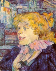
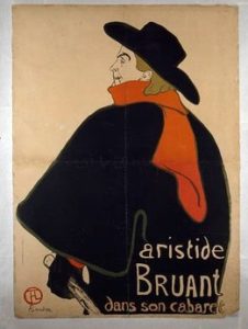
Montmartre. This compelling dramatic work was remarkable for its radical design. Lautrec has reduced his portrait of Bruant almost to abstract forms, with a limited palette of four colours, beginning with a keystone in olive green, then adding black, red and brown. The emphasis is on line and form, creating volume without shading, accentuated by the adoption of flat colours. The image is dominated by Bruant’s signature black cloak and hat, with the incredible slash of the bright red scarf that falls over his shoulder, as he holds the cane that completed his theatrical persona.

Also radical is the artist’s choice of viewpoint to depict the singer from behind. Despite the simplicity of the poster, something of the complex nature of Bruant’s character is conveyed, with his face in profile and his features delineated with just a few lines. François Gauzi described this complexity, and saw an analogy with his friend Lautrec’s complicated personality.”

              https://nga.gov.au/Exhibition/TOULOUSE


This economy of line and colour is something I have aimed for in some of my quick (5 minute) drawings.  Drawing quickly forces me to omit detail and outline the main features.  Drawing in ink prevents me form fussiness over getting positions and proportions too exact.  I think the results are more real than more detailed studies.

_____________________________________________________________________

Wednesday 2nd May 2018 –

Here I am writing my first blog.  Good morning World.

Today I enjoyed a session of short films organised by Trudie and Mary.  Some were funny, some were beautiful, some were neither.  The last was “The Silent Child” – an important and poignant story of a deaf child whose family were ignorant and insenstive to her isolation and unaware of their own insensitivity.

Scroll to top